
Overview
If you are a hosted customer with Kuali Research then system reports are available on the Reports tab to users with the appropriate permissions. The permission required to enable the Report tab option for a user is 'Run Global Reports' which is a part of the 'Run Global Reports' and 'KC SuperuserOSP' roles by default - but be aware this will give access to all reports within the Reports tab. These reports are only available to hosted customers currently and not to on-premise implementations.
This is a general overview of using some of the features in the Reports tab.
Copying Reports
If you are interested in creating a new report based on an existing one, you can do so by making a copy of that report, and tweaking it as needed. Select the report you would like to copy, and click on the three dots next to it, then select "Duplicate".
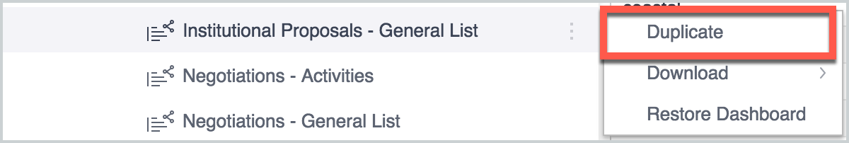
This copied version will be visible only to you, unless you choose to share it with others. You can make any edits you would like to this copied version, without affecting the original.
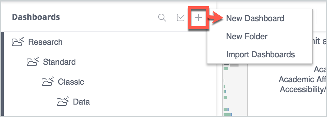
We recommend copying existing reports, but if you would like to create a new report, here is the process to do so.
Building a Report
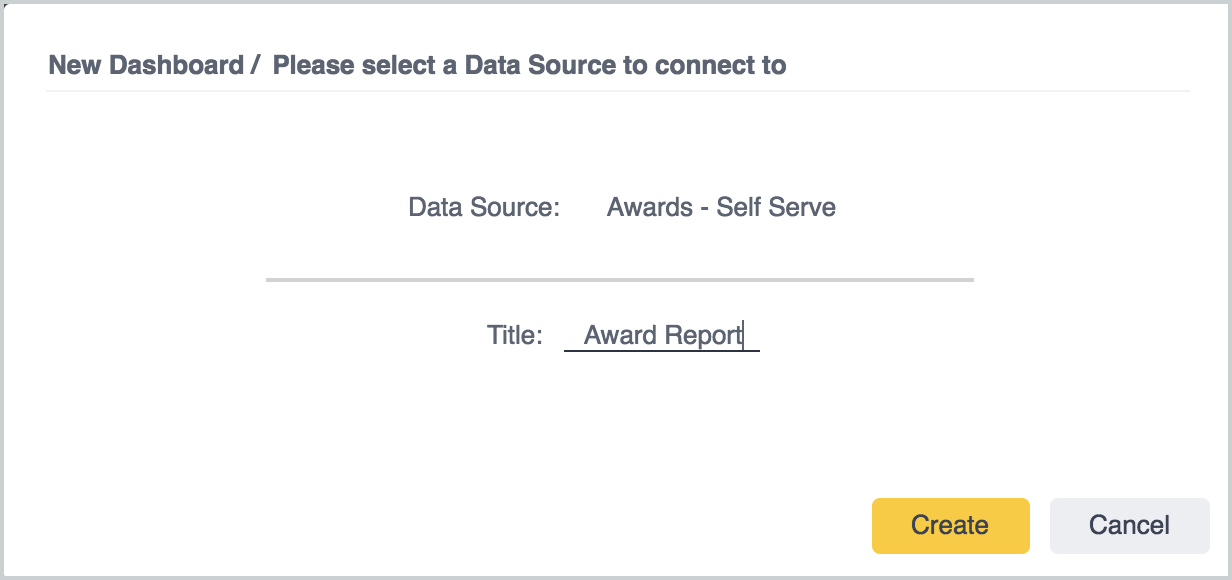
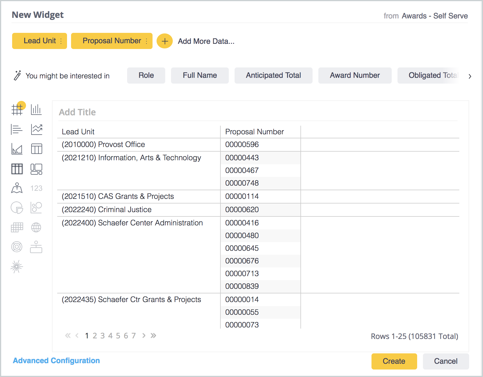
A report view is composed of multiple widgets. When you first create one, you will be asked to select a Data Source, which determines what kind of data this report will show (proposal, award, negotiation, etc.) and to enter a title.
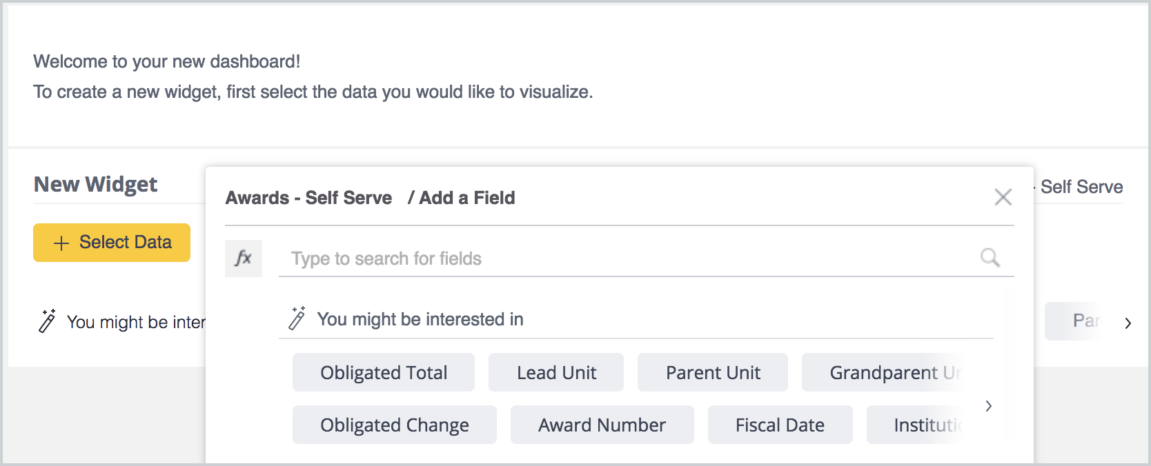
After clicking Create, you will be prompted to create the first widget in your report. You will see some suggestions for fields you might want to add at the bottom of the screen, and you also have the option to click + Select Data and search for and add fields from there.
Once you've selected some fields, they will be populated into a draft. From here you can see and change the types of widgets you can create with this data, add more fields, or add filters. You will continue to be able to edit all these options after you click Create to save this new widget.
It is possible to add subtotals to a pivot table widget. Just click on the three horizontal lines icon in the field you want to subtotal by (under Rows) and click Subtotals. This will add a subtotal row for any entry in this field that has multiple records.

You also have the option to highlight the subtotal rows in a different color in the Design menu on the right.

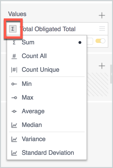
When adding Values, such as dollar amounts, the default calculation in the pivot table is Sum, but you have the ability to change this to count, unique count, average, median, min/max, variance, or standard deviation, depending on the type of analysis you need to display.
The other widget options are as follows:
| Widget Type | Notes | Required Fields |
| Area Chart | Displays values over time, with the option for them to overlap, show them as stacked, or stacked by percentage. | X-Axis (typically time), Y-Axis (numeric data) |
| Bar Chart | Displays values in categories, with the option to group by another category. | Categories (descriptive data, Y-Axis), Values |
| Box & Whisker Plot | Shows the distribution of a data set by quartiles. Hovering over the plot displays min, max, and median. | Categories (numeric data on the X-Axis), Values (Y-Axis) |
| Calendar Heatmap | Displays values over calendar days to identify trends over time, in increments of one month, one quarter, half year, or year. | Values, Date Selection (how many months are displayed) |
| Column Chart | Shows comparisons of values broken down by categories, particularly useful for comparing values over time. 'Break by' can be used to group the data. | Categories (at least one, but can have multiple), Values (X-Axis) |
| Indicator | Displays a value as a number or a gauge, with a description. A gauge type indicator will also show min and max values. For a value, there is the option to show a secondary value and description. | Value, Description |
| Kuali Table | This type of table is optimized for using custom data fields. Unused fields will be hidden. | N/A |
| Line Chart | Shows values over time, and useful for comparing changes to multiple categories over the same time period. Can be combined with a column chart, when comparing multiple values. | Time (X-Axis), Values (Y-Axis) |
| Pie Chart | This is a good way to display percentages or proportions in your data. Slices representing 3% or less of your data will be grouped into an "Other" category - clicking on this slice will expand it so you can view this selection. Selecting a slice will pull out that slice, and filter other widgets based on the selection. | Categories, Values (each is limited to one field) |
| Polar Chart | A visualization of multiple categories in a radial chart, with the option to group by another field. | Categories, Values (numeric data) |
| Scatter Chart | Displays two variables of data across two dimensions as points of various sizes, determined by their values. | X-Axis (numeric data), Y-Axis (numeric data), Point (descriptive data), Break by (descriptive data, determines point color) OR Color (numeric data that determines field gradient), Size (numeric data, determines point size) |
| Scatter Map | This allows you to plot geographical data (such as country, state/province, city, or latitude/longitude) as points on a map. | Location, Location Type, Values (will determine scatter point size) |
| Sunburst | The Sunburst is a visualization that combines multiple categories in a concentric ring-style pie chart. | Categories (descriptive data), Values (numeric data, limited to one field) |
| Table | Shows raw data in columns, without pivot-style aggregation. | N/A |
| Text | The Text tool allows you to add a text field as a report widget. This can be used to format your report, creating section titles, or adding analysis text, if needed. | N/A |
| Treemap | Shows hierarchical data as nested rectangles. | Categories (descriptive data, up to three fields), Size (numeric data, limited to one field), Color (can be numeric, or one of the Category fields, to group by color) |
Sponsor Hierarchy
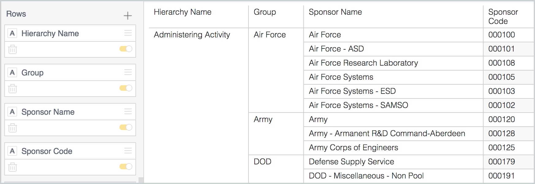
You can add Sponsor Hierarchy data to your reports either as a row or as a filter. This can be added to Award or Proposal data, by selecting the Hierarchy Name and/or Group from the Award Sponsor Hierarchy or Proposal Sponsor Hierarchy tables. The Hierarchy Name determines which sponsor hierarchy you're viewing (an individual sponsor can appear in multiple hierarchies), and the Group refers to the grouping of sponsors within that hierarchy (a sponsor can appear only once within a group). The Sponsor Hierarchy tables also include the Sponsor Code field.
Sharing
Once you've finished setting up a report, it can be shared with others. The Share menu allows you to schedule the emails, setting them up to send at a particular frequency, or whenever the data cube is updated. It can be shared this way with individuals, or with groups. You also have the option to share a report via email, or as as PDF attachment.
If you want to share across your entire institution (to those that have reports access) you can use 'Institution - <School>' with the < > being your school name. This allows you to share across your institution or to another Kuali Research institution so schools can collaborate/share reports they've built to their own institutional data.
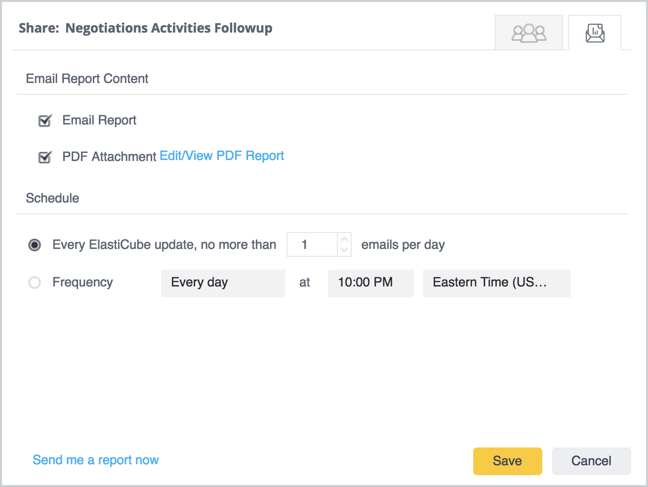
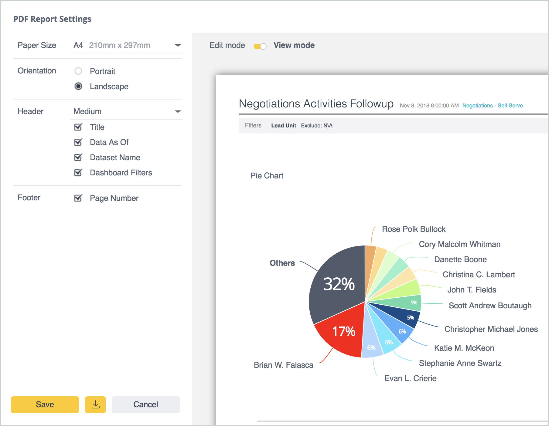
If you choose to share as a PDF, the Edit/View PDF Report link will take you to a preview of the PDF, where you can change the print settings (paper size and print orientation) and make adjustments to the header and footer style and contents. From here, you can save the PDF report settings, and download a copy of it.
Be aware when scheduling report delivery:
- Recipients will have to log directly into Research prior to following the email link directly. We’re continuing to work through this specific issue.
- Tables are not meant to be sent as a PDF so please keep that in mind when sending.
Shared folders and reports are denoted with a three connected dots icon.

You can click on the arrows pointing left or right to hide the left the right sidebars, if you need to increase the report viewing area.
If the "Other" category is selected, it will drill down to show the items that have been summarized into that category. A "Back" button will appear, allowing you to return to the previous view. Hovering over the "Other" category will give you a summary, showing the top five items and their values.
Hovering over an item in the chart legend will highlight that category in the widget. Clicking on it will filter it out of that widget.
Importing and Exporting
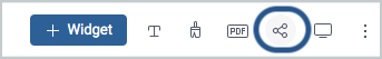
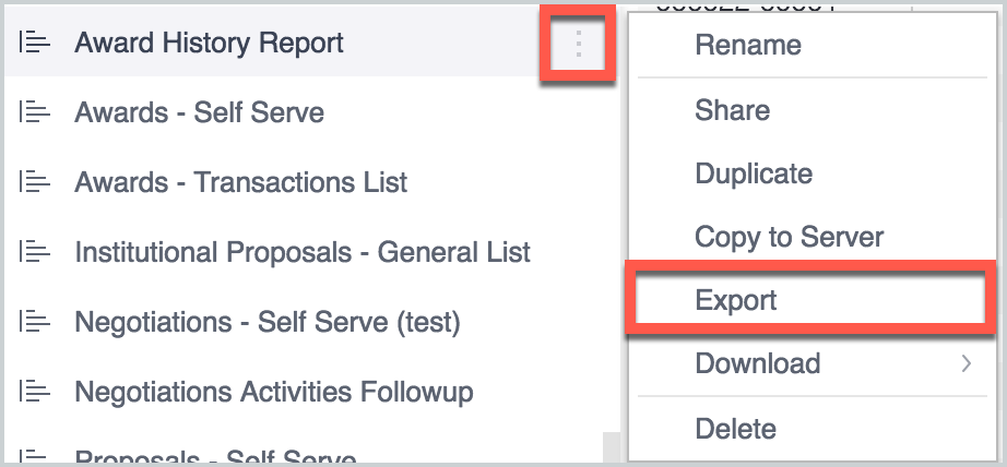
After a report has been created and tested in the sandbox environment, it can be moved to production. The report can be exported using this menu:
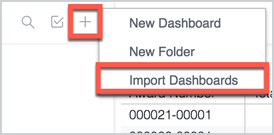
The report can then be imported, either on it's own or into an existing folder, using the Import Dashboards option available in the same menu as the one used to create new reports or folders.
Comments
0 comments
Article is closed for comments.